BlockFi
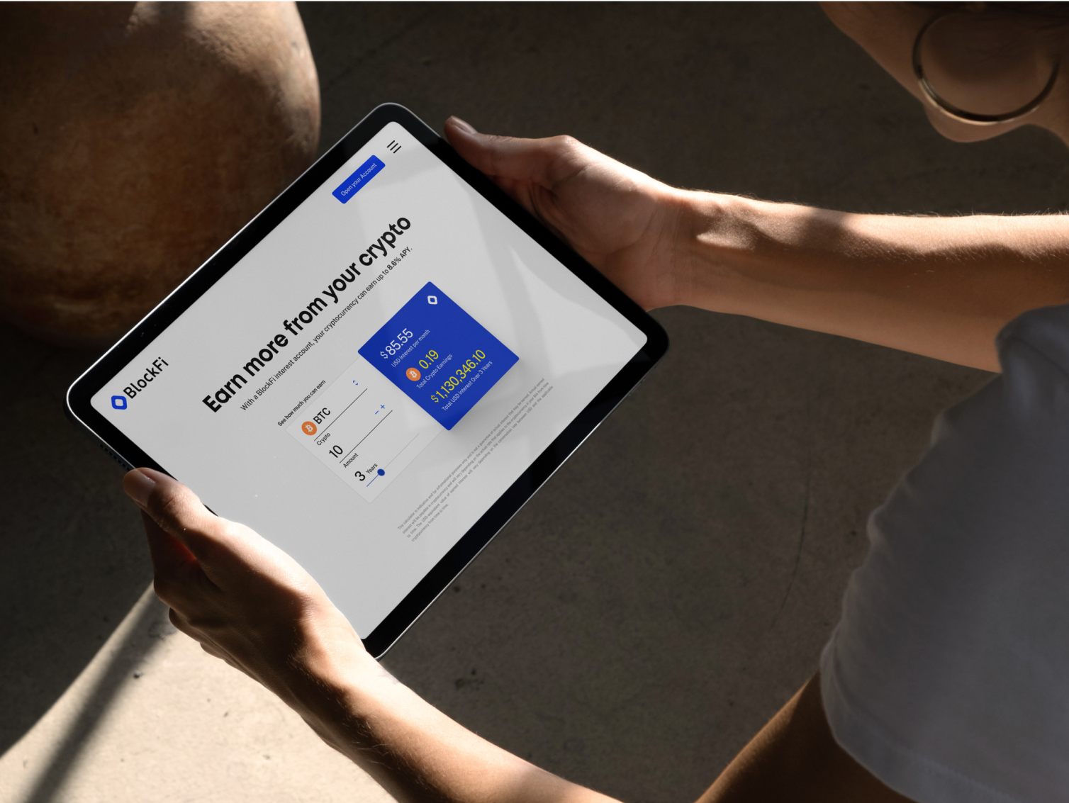
In the bustling world of financial technology, BlockFi emerged as a trailblazer, offering innovative cryptocurrency-based financial services such as lending, borrowing, interest-bearing accounts, and trading. Between 2019 and 2021, BlockFi experienced meteoric growth, with its user base skyrocketing from 10,000 to an impressive 225,000. Simultaneously, the team expanded from a modest group of under 100 members to a robust 850-strong workforce, all while securing significant funding that propelled the company's valuation to $3 billion in 2021.
The challenge
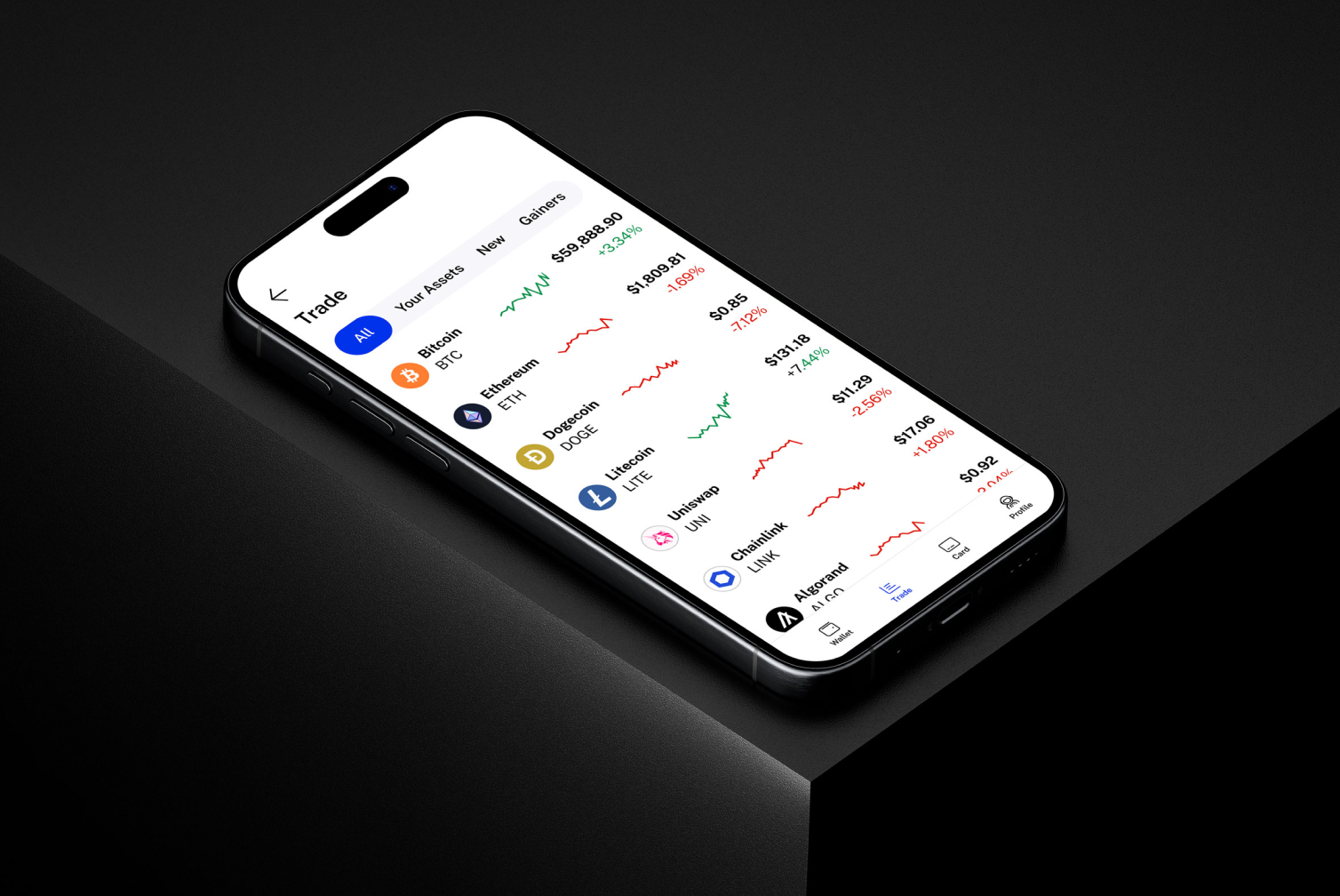
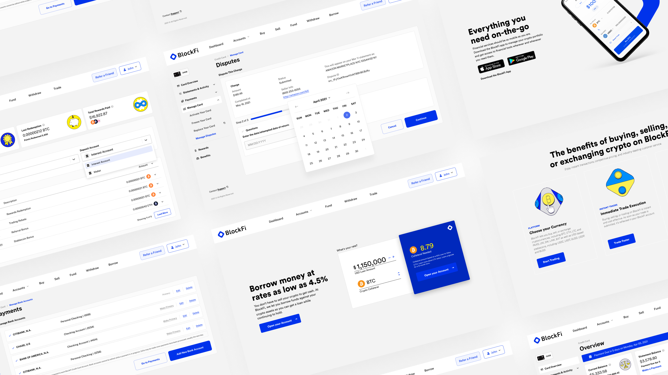
This rapid expansion brought its own set of challenges. As BlockFi grew, inconsistencies began to surface across its diverse product line. The once cohesive user experience started to fragment, leading to confusion and diluted brand identity.
Recognizing the need for a unified approach, the leadership set out to build BlockFi's first company-wide design system that would span mobile platforms (iOS and Android) and web interfaces. The mission was clear: establish a comprehensive library of design patterns, rules, assets, and UX guidelines to ensure consistency and scalability across all products.
Leading the design transformation
As the Design System Team Lead, I drove the development and launch of BlockFi's new design system. I managed the project from start to finish, leading a talented team of developers and designers to collaborate and innovate. By keeping projects on track, fostering communication, and maintaining design standards, I aligned our work with BlockFi's strategic goals. My leadership was essential in smoothly navigating the transition, resulting in a design system that meets current needs and supports future growth.
Embarking on the journey
The journey began with a deep dive into BlockFi's existing landscape. Conducting a comprehensive visual audit, the team meticulously reviewed all products and services, scrutinizing elements such as branding, tone, messaging, patterns, components, and templates. This audit was essential in identifying disparities and laying the groundwork for a unified design identity.
Research and benchmarking
Understanding that a design system is only as good as its alignment with user needs, the team conducted qualitative interviews with internal stakeholders and end-users. These conversations unveiled valuable insights into user behaviors, preferences, and pain points, providing a clear picture of what was needed to enhance the overall user experience. Additionally, functional benchmarking against leading apps in the industry offered inspiration, helping to shape a visual language that would resonate with BlockFi's diverse user base.
Transitioning tools
One of the pivotal moments in this transformation was the decision to transition from Sketch and Zeplin to Figma. The existing tools, while effective, lacked the real-time collaboration features that were becoming increasingly necessary for a rapidly growing team. Embracing Figma allowed for seamless collaboration, fostering a more integrated and efficient design workflow. To ensure a smooth transition, the team organized workshops and training sessions, empowering designers to harness the full potential of the new platform.
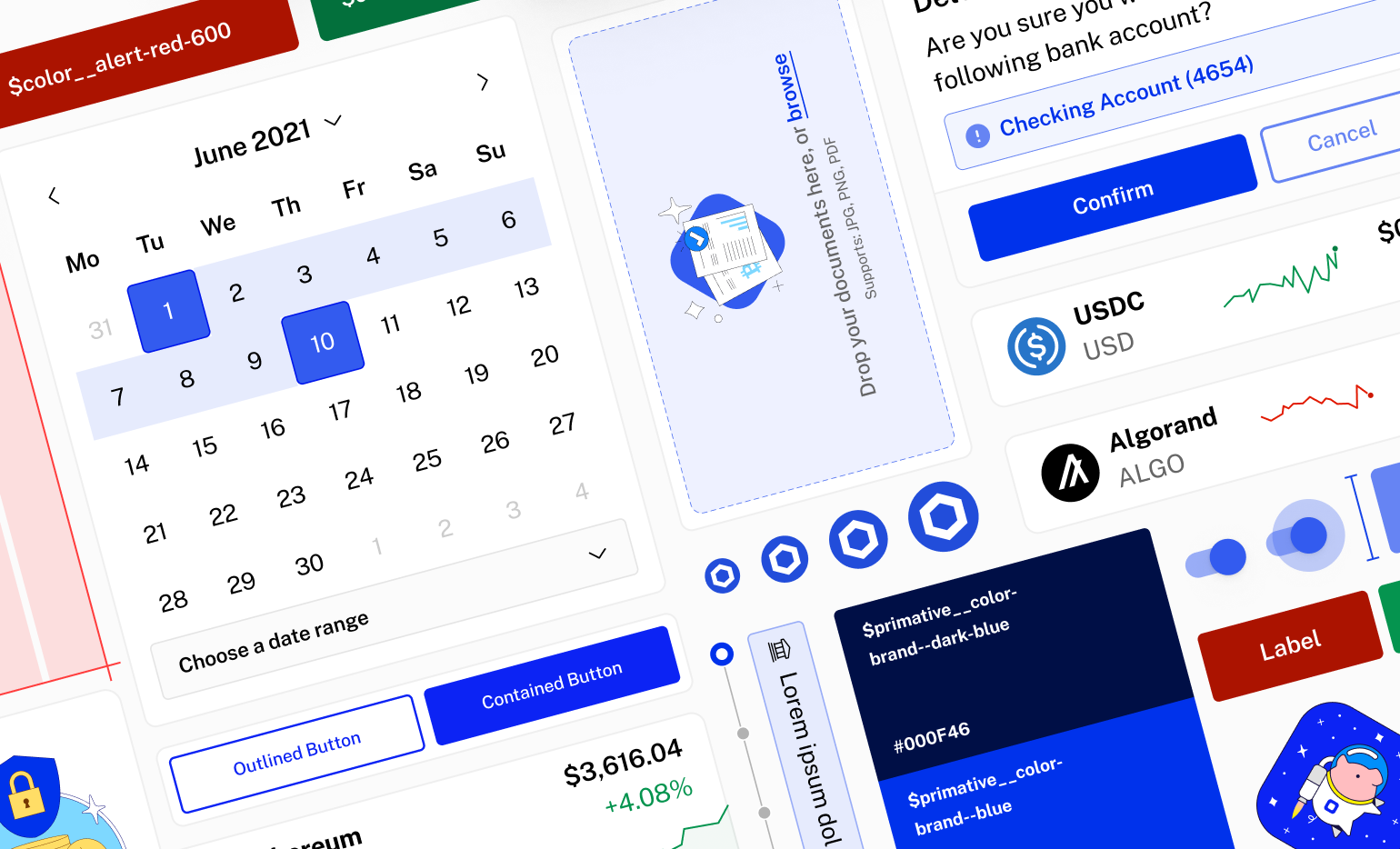
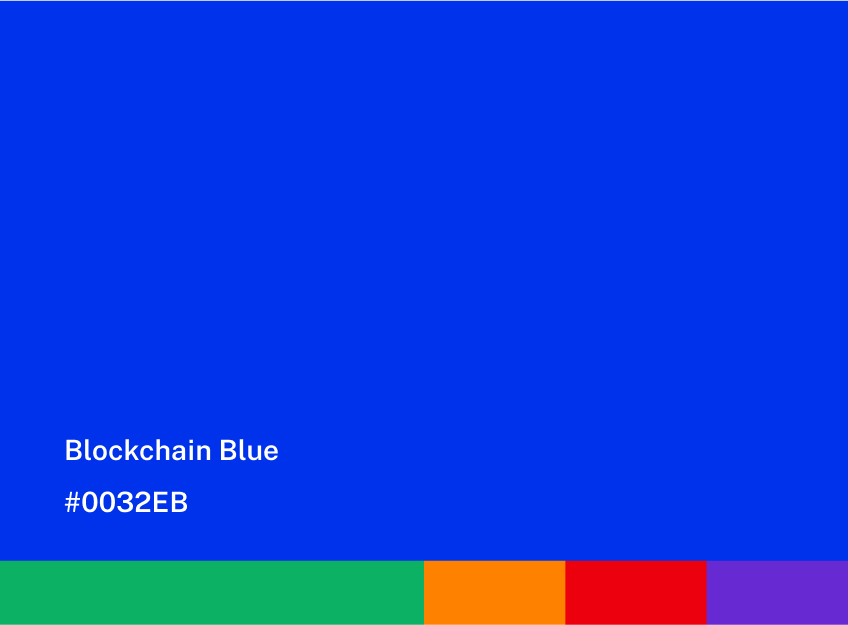
With the tools in place, the focus shifted to organizing design patterns using atomic design principles. This approach involved defining the fundamental elements of the design system—typography, color schemes, iconography, illustrations, and UI rules such as density, contrast, padding, margins, and columns. These foundational elements were crafted to ensure that every design aspect was functional and aesthetically pleasing.
Implementing components library
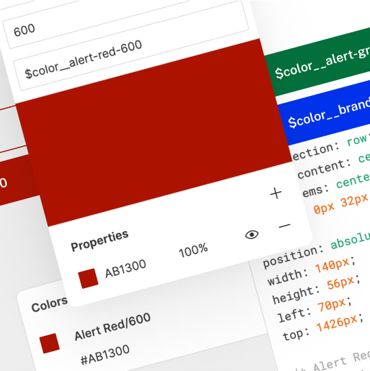
A critical aspect of the design system was the implementation of design tokens. These tokens defined UI elements across various themes and platforms, ensuring visual consistency whether users interacted with BlockFi in light or dark modes. By establishing variables for color schemes, typography styles, spacing, and other design properties, the team made it easier to maintain adaptability and uniformity across the entire platform.
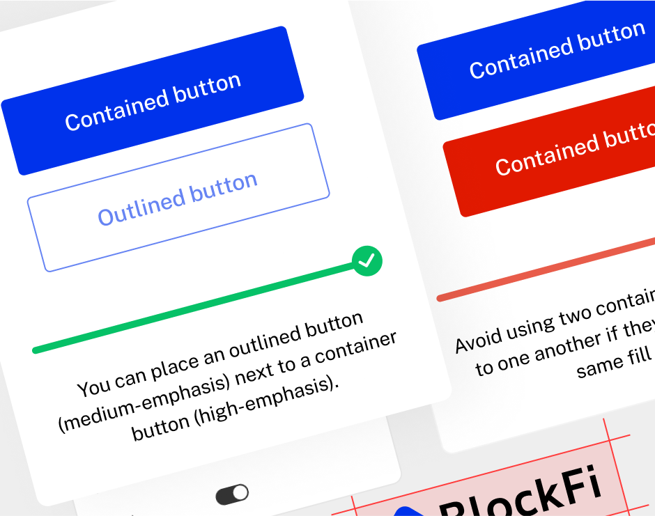
Building on these tokens, the next vital step was to create a components library. This library comprised essential UI elements—search fields, buttons, data tables, and range selectors—designed to be reusable and adaptable across different contexts. The components library not only streamlined the design process but also significantly reduced development time, ensuring every application maintained a consistent look and feel.
Collaborating for success
Collaboration was the cornerstone of this endeavor. Working closely with the front-end development team, the designers and developers co-created component and template asset libraries. This synergy enhanced team performance and ensured the end-user experience was seamless and consistent across all platforms. By bridging the gap between design and development, BlockFi created a cohesive and intuitive interface that users could easily navigate.
'Developing and adopting this comprehensive design system provided us with a unified framework that not only streamlined our design processes but also fostered better collaboration between our design and development teams.'
Sarah Mitchell
Senior Product Designer at BlockFi
Achieving transformation
Implementing the new design system impacted BlockFi's workflow and design culture. Team productivity surged by an impressive 46%, a testament to the efficiency gains from having a unified and scalable design framework. Moreover, the time from project ideation to launch was significantly reduced, allowing the company to iterate faster and release new features with greater agility.
These improvements translated directly into enhanced user experiences. The consistent and high-quality interfaces simplified navigation, reduced discovery time, and increased user engagement. Users appreciated the seamless and intuitive interactions, boosting brand awareness and loyalty. The unified design language strengthened BlockFi's brand identity and favored the company in the competitive fintech landscape.
BlockFi Rewards Visa® Credit Card
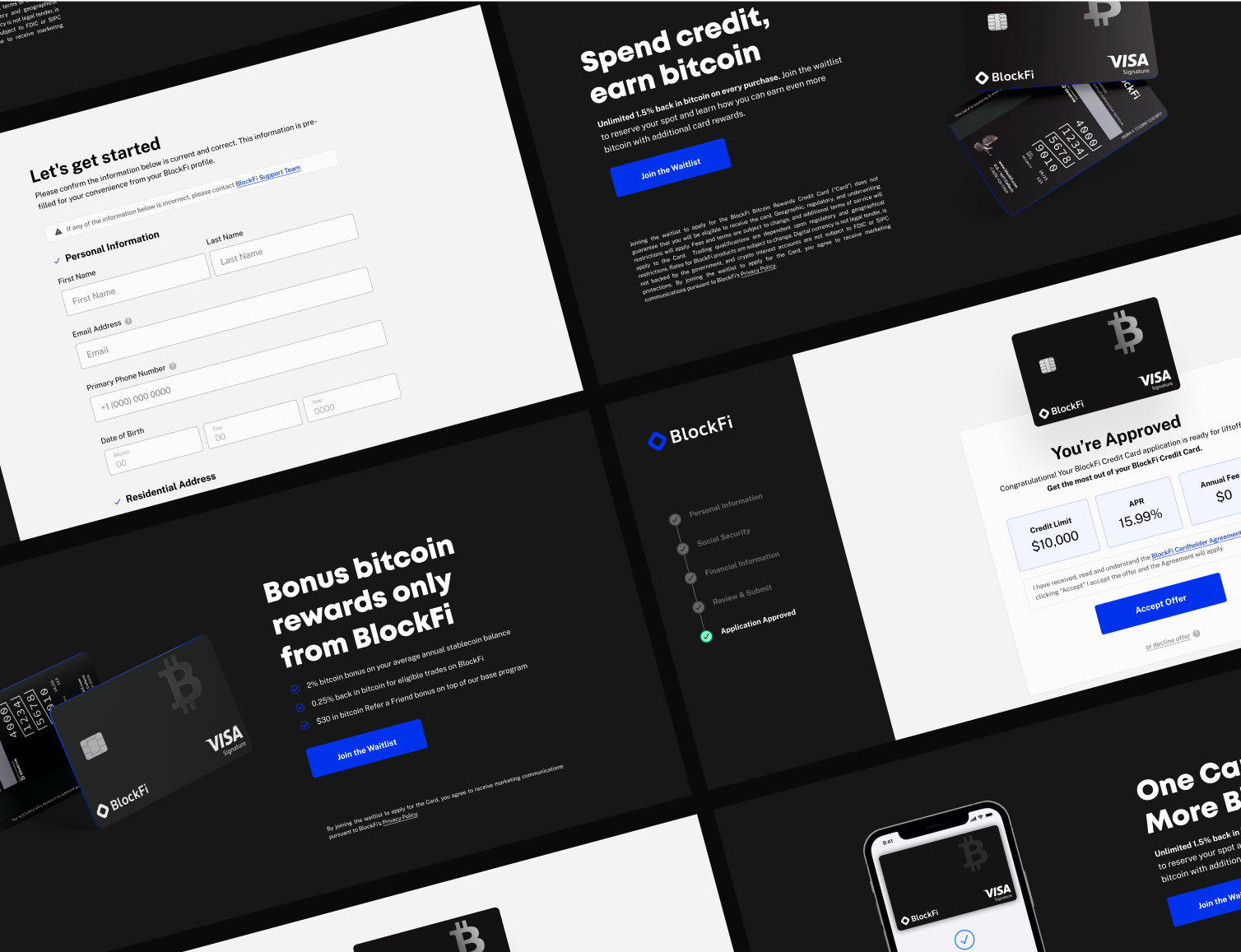
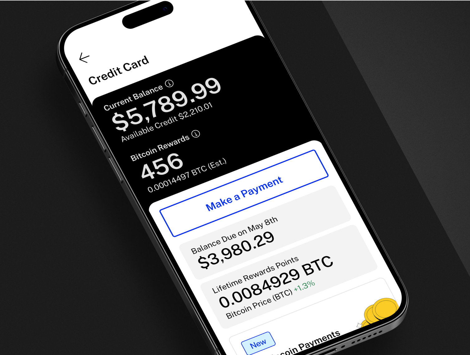
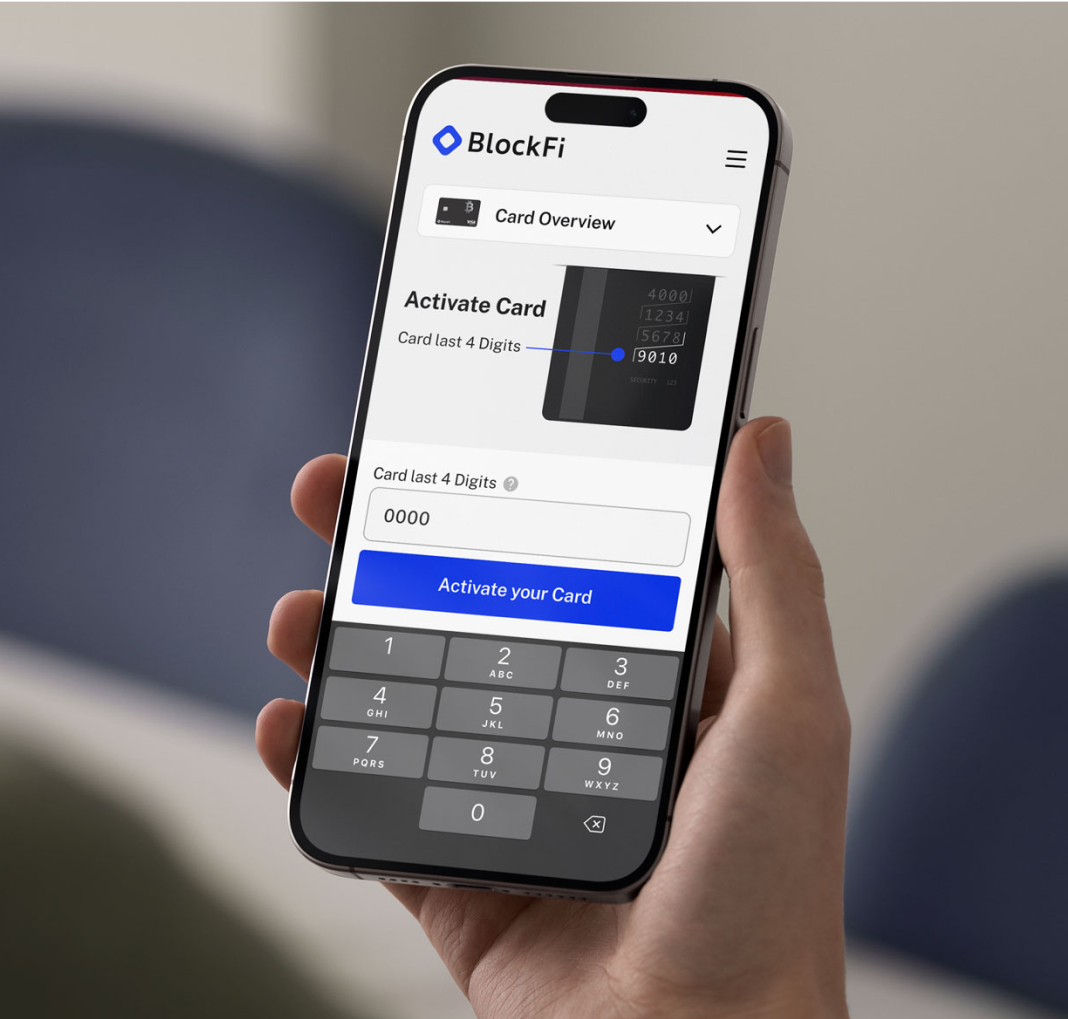
One of the standout successes facilitated by the design system was the development and launch of the BlockFi Rewards Visa® Signature Credit Card—the first credit card in the US to pay rewards in Bitcoin for every eligible purchase. Leveraging the unified design framework, the team created a seamless and engaging user experience across mobile and web platforms. The card campaign launch successfully attracted over 87,000 users within the first month. This achievement demonstrated the design system's effectiveness in supporting innovative product launches and reinforced BlockFi's position as a leader in the fintech industry.


Conclusion
By establishing a robust and comprehensive design system, BlockFi successfully navigated the complexities of rapid growth. This initiative ensured consistency, scalability, and accessibility across all its financial products, fostering a cohesive user experience that resonated with a diverse and expanding user base. The transformation not only streamlined internal processes but also reinforced BlockFi's position as a leader in the fintech industry, demonstrating the profound impact that thoughtful design can have on a company's success.
